Posted: 3rd April 2019
Five Minutes With... Peter Gander, Map maker
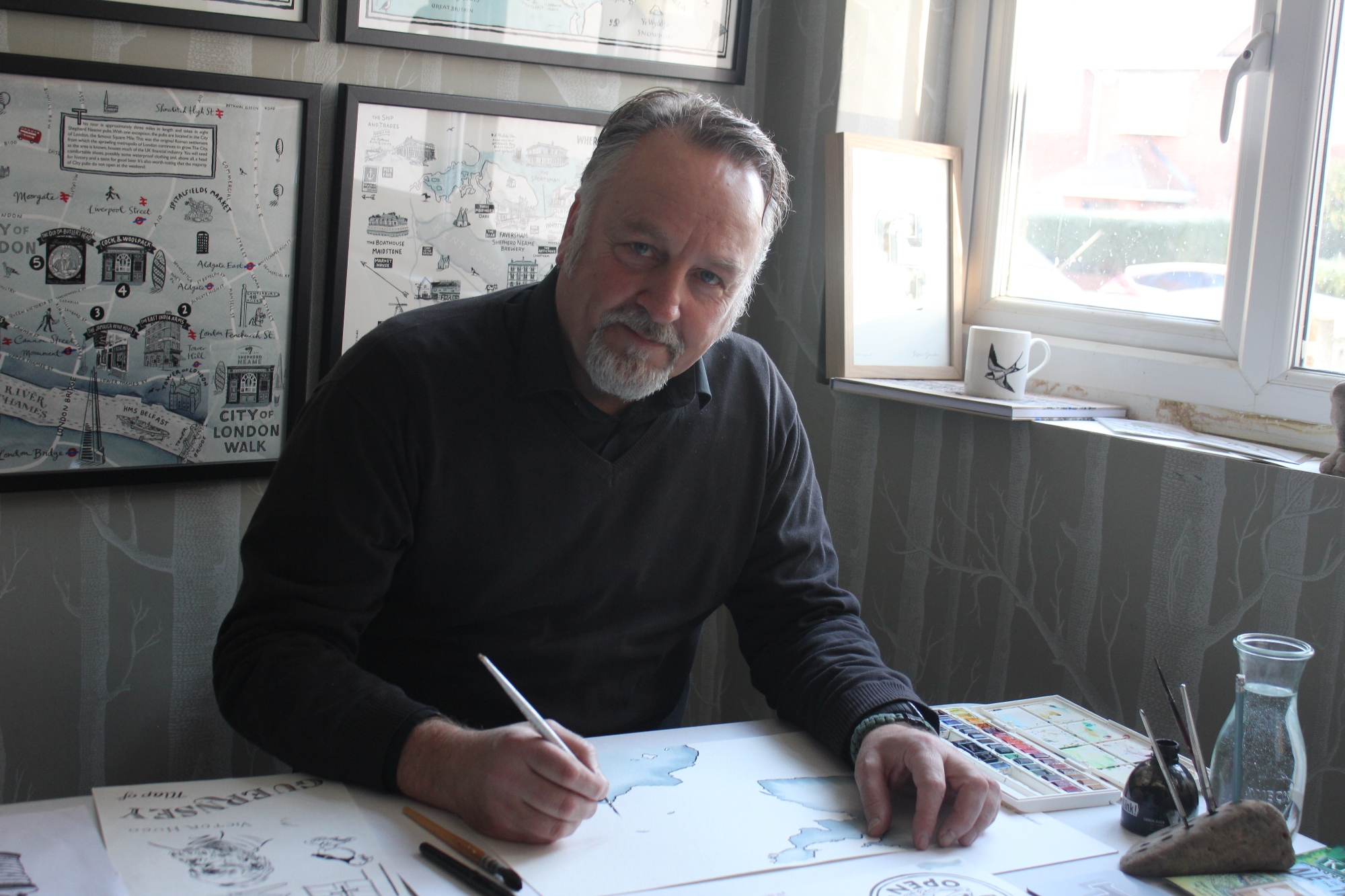
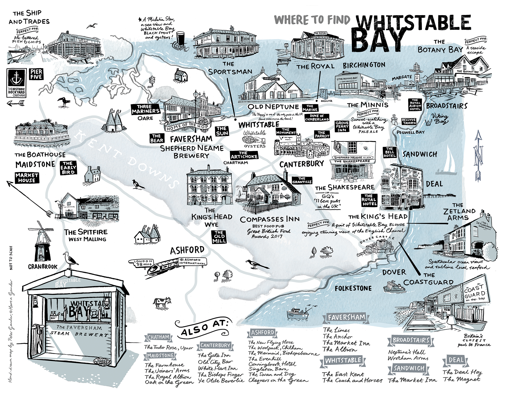
Peter Gander is a graphic designer and illustrator who, alongside his wife Fiona, runs the Herne Bay-based company Have A Gander. His map for our City of London Pubs is the second he has produced for Shepherd Neame following 2018’s Whitstable Bay illustration.
How did you become an illustrator and what is your background?
After a year’s foundation course at Barnet College of Art (I lived in north London prior to moving to Kent) I trained at Canterbury College of Art, now UCA, where I obtained a BA in graphic design. After that I worked as a graphic designer, working on packaging and brand identity, later becoming an art director, where ideas were the main output, for advertising and marketing campaigns for London agencies.
Describe the creative process that goes behind producing something like the City of London Pubs map.
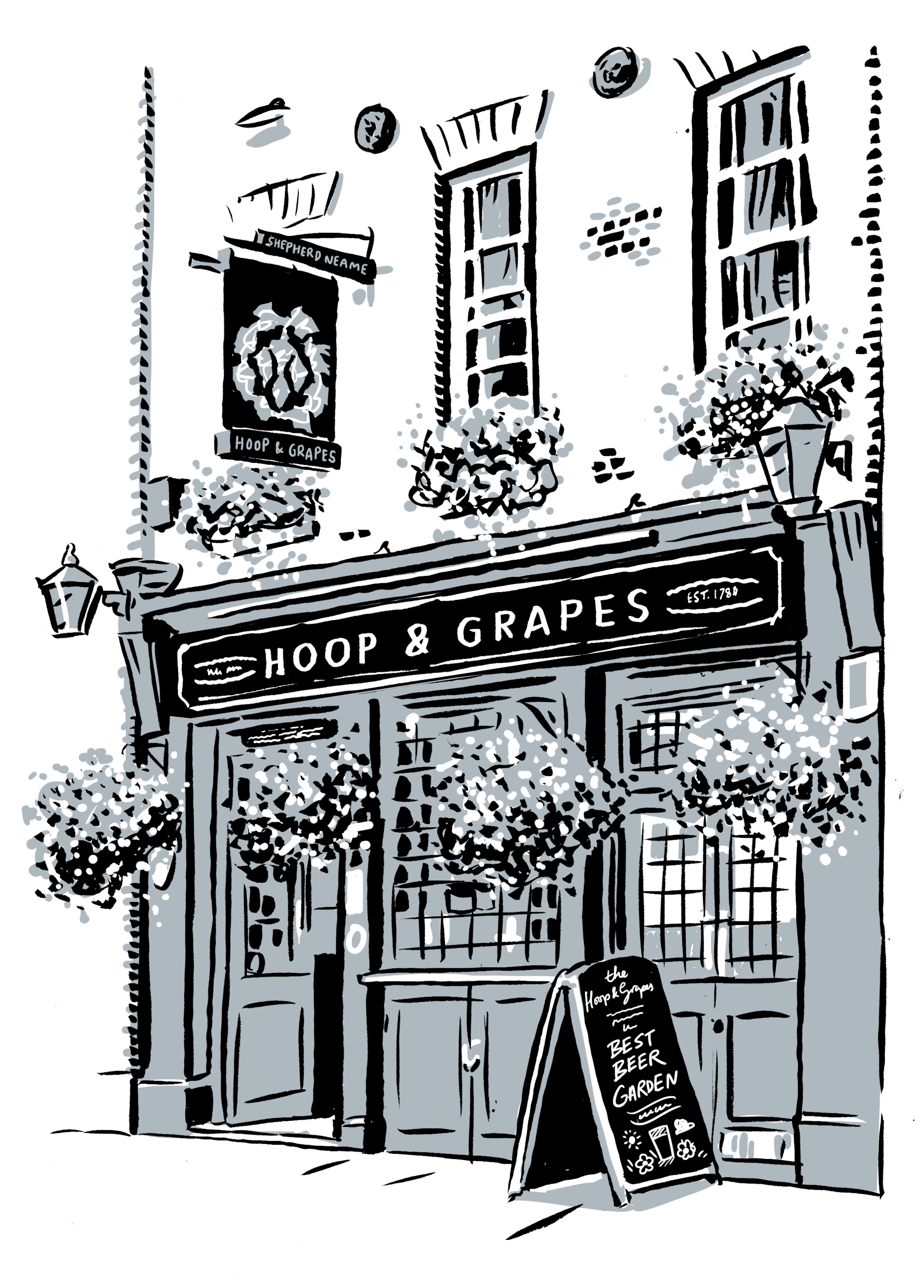
I had already produced work for Shepherd Neame so they knew my style, so it was simply a matter of establishing the content of the map. I was supplied a list of City pubs that were to be included, so the first thing was to establish where the north, east, south and west parameters were. That then gives me an area to work within. Once that’s established, I’ll sketch - or ‘scamp’ - out the map in black and white pencil. This is then emailed to the client for approval. Usually there are tweaks. I’ll resend the scamp and finally, once approval is given for the final mono version, I go ahead and draw the final artwork in ink and watercolour. The maps are also enhanced and drawn digitally afterwards, For instance, the roads are hand-drawn with a Wacom tablet and pen, digitally.
Were you familiar with any of the pubs that featured on the map?
Indeed I was. When my brother and I both worked in London, the City was a good central meeting place. I’ve been to around six of the eight pubs shown on the map.
You seem to produce a lot of maps. What is it about maps that fascinate you?
Maps fascinate a lot of people. I think it’s the detail that draws you in. It’s a good fit with Shepherd Neame beers too, which are hand-crafted like our maps. The maps often contain humorous touches, too, such as the City gent or Chaucer on horseback by the Canterbury Bishop’s Finger sign. Maps can also embrace all kinds of ideas: I am currently working on a map of Florence Nightingale’s London for a museum.
Your style is distinctive. What are your influences?
Initially, the cartoons of The Beano and Lewis Carroll’s drawings of Alice in Wonderland. I was also impressed by the ink work of Aubrey Beardsley. He had an amazing ability of balancing black and white ink in the most beautiful way. The ‘scratch pen’ he used, and I use, gives a characterful stroke as it spreads wide when it is pressed and reverts to a narrow line when the pressure is eased off. This gives you a very graceful line, unobtainable by a fixed-width modern pen.
Illustrating a walk between pubs must have been thirsty work. Do you have a favourite Shepherd Neame beer? And do you have a favourite Shepherd Neame pub?
Thirsty work indeed. My favoured Sheps beer is Bishops Finger. My favourite Shepherd Neame pub in local to me, the Divers’ Arms in Herne Bay. It has fascinating recessed portholes in the wall depicting little underwater diving scenes, a creative feature that initially attracted me. That and the pool table. It’s also a good venue for live bands.
Read more about the map and download a copy here: City of London Map
You can also download the Whitstable Bay map